.png?width=48&height=48&name=joomag%20favicon-blue%20(2).png)

Embracing the Mobile-First World: A Guide for Digital Success
If you’re into SEO, then you know it’s all about helping people find the right content at the right time.
Google’s been at it for 20 years now. It’s the most popular search engine in the world, and it’s even slipped into our vernacular as a common verb. Don’t know something?

Don’t get too comfortable with your SEO strategy, though. Google’s thrown another curveball at us, and this time it’s called “mobile-first indexing.”
In this blog post, we’ll cover the basics of Google’s ambitious mobile initiative, how it impacts SEO, and what you can do to get ready.
What is mobile-first indexing?
Mobile-first indexing is Google’s initiative to prioritize mobile versions of content for indexing and ranking. It’s a bold move, but a smart one too. Global mobile data traffic is projected to increase nearly sevenfold between 2016 and 2021. With mobile-first indexing, smartphone and tablet users, for example, will have a much easier time finding what they're looking for.
“Historically,” says Google, “the index primarily used the desktop version of a page's content when evaluating the relevance of a page to a user's query. Since the majority of users now access Google via a mobile device, the index will primarily use the mobile version of a page's content going forward. We aren't creating a separate mobile-first index. We continue to use only one index.”
Googlebot, the company’s proprietary web crawler, filters and indexes pages with a smartphone agent. Google says that it will continue to display URLs (desktop or mobile) that are relevant to users in search results. That’s good news.
Preparing for Mobile-First Indexing: Practical Tips
Google’s algorithm is shaking things up, and the search giant is finally getting serious about mobile content. Naturally, marketers will want to know how it impacts their SERP rankings.
You won’t get very far if you don’t know how Google crawls and ranks your content. Luckily, there’s no need to panic if your mobile website isn’t ready yet. Google’s taking it easy and rolling out its new strategy bit by bit. Desktop websites can still get ranked, but you’ll need to future-proof yours at some point (or you won’t get many visitors). Prepare yourself with these helpful tips:
-
Ironically enough, mobile websites aren’t required for mobile-first indexing. Google will still index desktop versions, but they’ll be harder to rank. If you’re unsure of your website's mobile standing, try Google’s mobile friendliness tool. Just enter the URL of your website and run the test.
-
Encourage mobile users to browse through your content. Desktop viewers aren’t hard to please, but mobile audiences are a different story. They’re used to viewing websites on small screens. That’s why UX design is so important. Convenient navigation tools like hamburger and accordion menus are still perfectly fine to use on your mobile site, says Google.
-
Mobile screens are tiny, which makes reading from them hard. You’re not working with a whole lot of real estate here. If you want to attract a strong mobile audience, your website copy needs to be mobile-friendly. Go for shorter sentences and tighter paragraphs. Organize text and other on-screen elements with whitespace. Choosing the right font matters as well; ensure it’s clear, large enough, and easy to read.
-
Your website should be responsive and fast, especially for mobile users. Quick loading times and high-quality images contribute to a positive user experience, which in turn improves your rank.
-
Whatever you do, don’t launch an undeveloped mobile website! Doantam Phan, Google Product Manager, notes that “a functional desktop-oriented site can be better than a broken or incomplete mobile version of the site. It’s better for you to build up your mobile site and launch it when ready.” Currently, Google will still index the desktop version of your domain without penalty if it can’t find the mobile site. But that’s liable to change, and you don’t want a clunky, slow-loading mobile site representing your brand when it does.
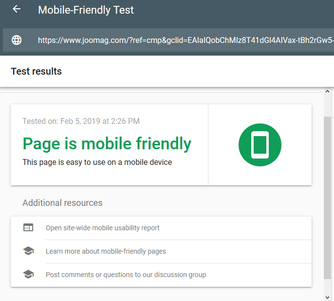
Took Google's mobile-friendly test and saw this? Congrats, you're in the clear!
Mobile-ready content with Joomag
Mobile media is transforming how we create and consume content. With on-demand services appealing to a whole new generation of impatient consumers, you’ll need to get your message across (and fast).
It’s been 4 years since mobile browsing surpassed desktop for the first time in history. Since then, more and more people have continued to rely on their smartphones instead of their PCs to access the Internet.
Let’s be honest, there’s nothing quite like shopping in your pajamas, from your couch, or from the palm of your hand. Mobile browsing is incredibly convenient, and visitors expect quick loading times and responsive content. They’ll leave if they don’t get either. So, is your content ready to hit the big (little) screen? Great, because every digital publication you create with Joomag is optimized for all mobile and web platforms, including Android, iOS, and Windows!
Offer viewers another high-quality reading experience by publishing your content on the official Joomag Newsstand App. It’s available for both the App Store and Google Play, so all of your bases are covered.
Branded apps with Joomag
Apps are becoming popular brand portals and go-to content sources for the connected generation. In fact, mobile apps are expected to generate around 190 billion U.S. dollars in total revenues by 2020.
Don’t ignore your mobile audience. Order a custom-branded app and we’ll build it for you. Then use it to publish your content, engage potential customers, and open up new revenue streams for your business.
With Joomag, it’s your brand on every phone. Features include:
- Branding: incorporate the look and feel of your business into your app. Include your logo, add custom colors, and flesh out your mobile application with many more customization options.
-
A centralized viewing experience: allow viewers to download your branded app and access your content from one place.
-
Insta-publishing: once your content goes live, it’s automatically published on your app. Readers will receive a notification about it, too.
-
App upkeep: we’ll build your application from the ground up and constantly update it with new features.
What does mobile-optimized content look like?
We’re glad you asked! Here are some examples from a few of our own publishers:


FAQ
What's mobile-first indexing?
Answer: It's Google's method of using the mobile version of your content for indexing and ranking to cater to the increasing number of mobile users. As mobile internet usage grows, ensuring your content is mobile-friendly becomes essential for good SEO performance.
How do I get my site ready for mobile-first indexing?
Answer: Check your site's mobile friendliness with Google's tool. Focus on making your site responsive, with quick load times and designs suited for small screens, like readable text and easy navigation. If your mobile site isn't ready, prioritize developing a functional version before launch.
How can Joomag help with mobile content optimization?
Answer: Joomag ensures your publications are optimized for all mobile devices, making your content easily accessible on platforms like Android, iOS, and Windows. With features like the Joomag Newsstand App and the option for custom-branded apps, Joomag helps your content reach and engage your mobile audience effectively.


