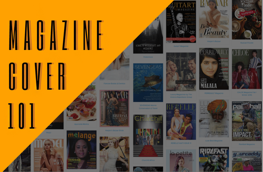
Books shouldn’t be judged by their covers, but digital magazines certainly are. Your magazine cover is your chance to make your publication the one that customers choose. Maintaining the balance of brand consistency and mixing things up enough to engage readers and keep them coming back can be a juggling act. Luckily, we’re here to walk you through the process.
Starting from the Cover: A Guide to Magazine Covers
Your masthead, more than anything else on your magazine cover, is your brand. It should be instantly recognizable, but you’ll never build any kind of brand identity if you’re not consistent. Some flexibility is okay, like changing color depending on what palette you’re using for any particular edition, but it should still be instantly recognizable from edition to edition.
While some people might tell you that your masthead placement is absolutely sacred, don’t feel like you can’t put anything over it. Like any deviation from the norm, it can be used to grab attention. So, be thoughtful about it.
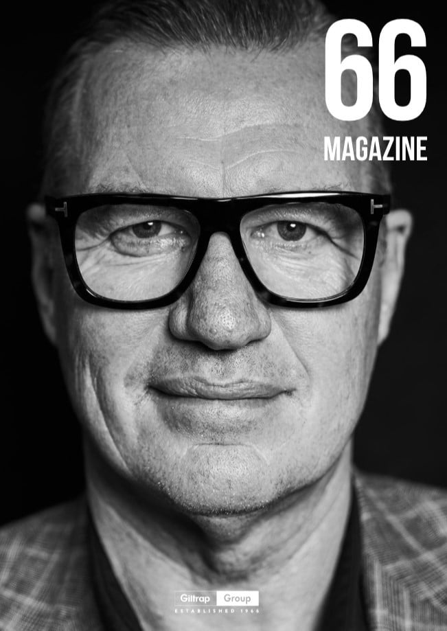 Image is Everything
 Since your magazine will be judged by its cover, keep your contents in mind when designing it. That starts with your choice of cover art.
Having your cover model make eye contact with the camera is a time-tested and true way to grab a customer’s attention. It’s a great way to quickly engage with a viewer who may be walking by a rack of magazines or scrolling through an online newsstand.
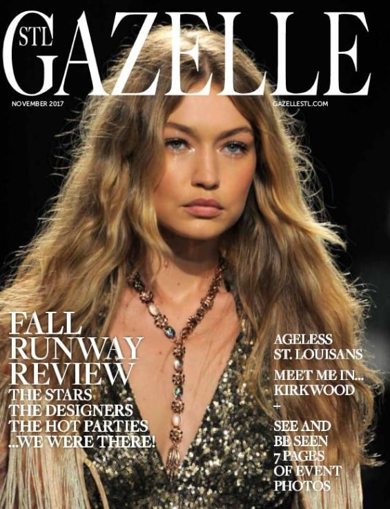
On the other hand, choosing another pose will draw interest because it’s so outside what people have come to expect. Don’t be afraid to think outside the box!
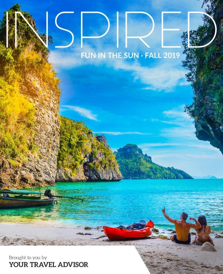
Not all magazines benefit from having model on the cover. Creating a travel magazine? A gorgeous landscape photo will do more for you than any covergirl (or guy).
A well-composed shot of an appetizing dish can sell your foodie mag better than a celebrity chef on the cover.
 But before photography became commonplace, illustrated magazine covers were the norm. While most publications have moved away from illustrated covers, it can still be a valid choice. Some magazines eschew photography altogether and go for illustrations instead. The New Yorker is probably the most famous publication that goes this route.
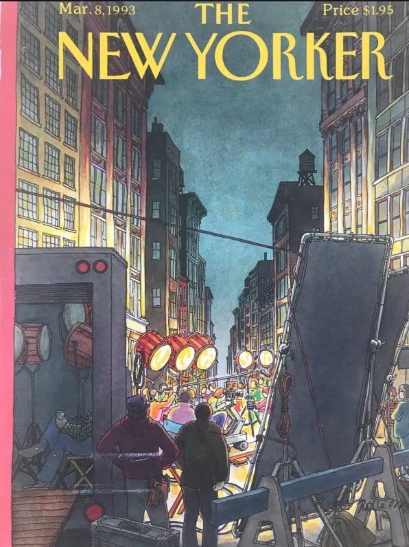 And sometimes, words are worth a thousand words. Typography can be used alone if you’re not afraid to be bold. However, with no artwork to prop it up, make sure that your text is engaging enough carry the weight of a cover by itself.
Don’t be afraid to mix things up, too. Illustration and words can play nicely with photographs.
Down to Magazine Cover Details
We won’t go too deeply into color theory here (that’s a post all by itself), but it’s important to have a harmonious color palette in mind when you’re designing your cover. The colors of your design elements should mesh well with your choice of cover art.
Speaking of color, make sure that you have light text on dark backgrounds and dark text on light backgrounds. You’d think this would be obvious, yet people still keep making that mistake.
Instead of fighting your background photo to find a place for your text, use it to inform your text placement. For a 3-D look, consider putting some text behind your cover image and some text in front of it. It creates a sense of depth in an otherwise flat surface.
Magazine Cover: Consistency is Key
Creating Magazines with Joomag
Joomag is a digital publishing and content experience platform, that allows publishers to create digital interactive magazines and experiences. You can effortlessly craft captivating magazine covers by customizing them with photos, changing background colors, incorporating logos, selecting custom fonts, and more. Additionally, you have the option to add video backgrounds and integrate first-party data forms to gather valuable insights from your readers. Need inspiration? Visit Joomag's showcase to see many gorgeous digital magazine examples.
FAQ
Q1: Why is the masthead crucial for magazine brand identity?
A1: The masthead acts as the face of your magazine, essential for brand recognition. While it should remain consistent to build a strong identity, slight adjustments—like color changes for different issues—can keep it fresh yet recognizable. This balance ensures your magazine is both identifiable and adaptable.
Q2: How do you choose impactful cover images?
A2: Effective cover images require thoughtful selection. Engage viewers with direct eye contact from models, or surprise them with unconventional poses. For thematic content, like travel or food, choose images that speak directly to those interests, such as captivating landscapes or mouth-watering dishes. Exploring illustrations or dynamic typography can also set your magazine apart, inviting curiosity and interest at a glance.
Q3: Can Joomag aid in creating standout magazine covers?
A3: Absolutely, Joomag simplifies the creation of standout magazine covers with its versatile toolkit. Customize your covers with a blend of personal imagery, engaging videos, distinctive logos, and unique fonts. Joomag also supports interactive elements like video backgrounds and reader data forms, enhancing engagement. Need ideas? Check out Joomag's showcase for inspiration. This platform enables you to craft covers that are not only professional but also deeply engaging.


