When you’re reading up on how to use design to build a stronger brand, the same word keeps coming up: consistency. But how do you go about being consistent when you have one person writing your content, another person creating your graphics, a third person doing your magazine layouts, yet another one doing your photoshoots, and so on?
Easy. You just need a style guide.
Creating magazine style guide, on the other hand, isn’t quite as easy. However, it will save you the effort of trying to unify your content in the future. Later this week we’ll cover how to create an editorial style guide for your content. Today, we’re focusing on visuals. Specifically, these three elements:
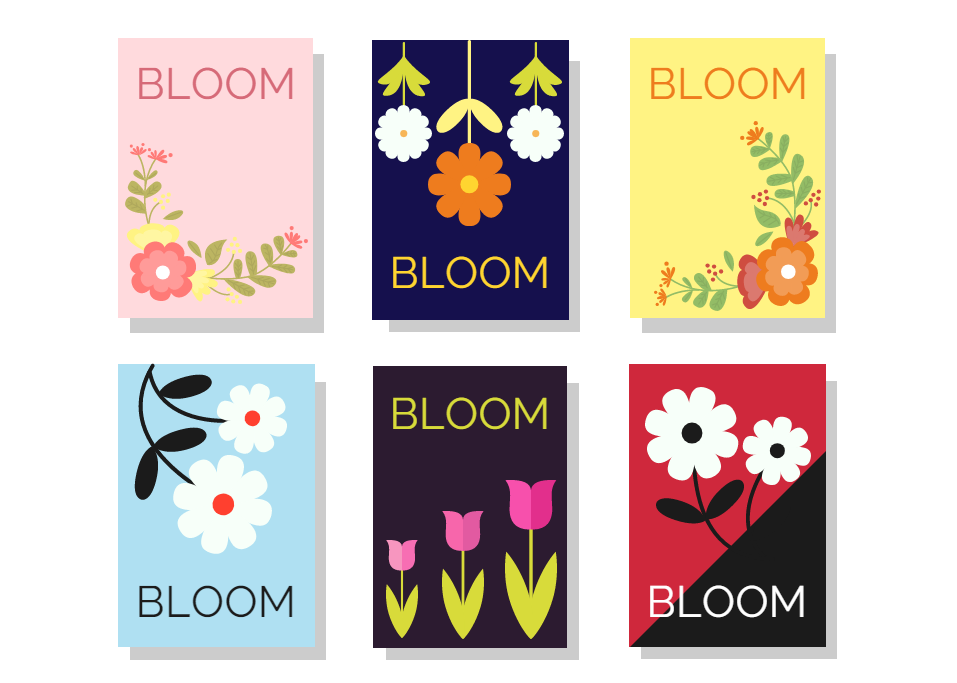
Typography
What’s your text going to look like? Try to limit yourself to three typefaces. This article can walk you through the process. Words convey meaning, but how they look also sends a message. Also consider how many cover lines or subheadings you’ll use.
Images
Even if your magazine is more focused on text that imagery, a picture is still worth a thousand words. What do you want the images you use in your magazine to communicate? Tone is just as important here as it is in the words that you choose.
Color palette
If you already have a well known logo, you should derive your color palette from it. Starting from scratch? Check out our color palette creation guide or use an online tool like Coolors. However, if you’re going to switch up your color scheme every issue, make sure the rest of your branding is strong so that you can maintain a sense of consistency.
To illustrate how these three elements work together, take a look at the covers of these two magazines from the Joomag Newsstand:
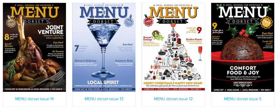
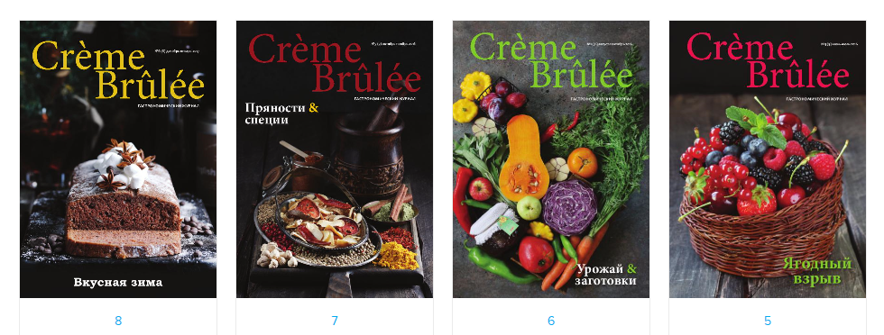
MENU Dorset features a centered masthead mirrored by balanced/mirrored/symmetrical imagery. There are several subheadings as well. On the other hand, Crème Brûlée uses simple typography and hardly any subheadings, depending instead on using lush food photography to sell the magazine. As for color schemes, Crème Brûlée and MENU Dorset both changes theirs up issue by issue, depending instead on consistency in their typography and imagery.
Why these differences? Well, even though both of these online magazines cover food, they have two very different approaches. Crème Brûlée focuses on a specific category of food in each issue, so its choice of cover art is chosen so that you can literally judge the magazine by its cover. You don’t have to be able to read Russian to know that these specific issues are about berries, seasonal vegetables, etc.
Meanwhile, MENU Dorset is about a local culinary community. Its masthead is much stronger than the simple serif font that Crème Brûlée uses. Even the cover imagery, whether it’s a collage or a single dish, is symmetrical (or nearly so) and points up at the masthead. There’s also several cover lines about what you can read about inside. Its articles are more varied than Crème Brûlée’s, so it needs to be more literal about telling you what’s inside instead of depending on a single image and theme like Crème Brûlée does.
With these examples in mind, think about what your digital magazine is trying to convey. Is your tone serious, or are you trying to tell a fun story? What about your audience? Is it a small niche or or a more general audience? Is your topic broad like MENU Dorset or more focused like Crème Brûlée? Let these questions inform your choices and you’ll be well on your way to creating a guide that will bring consistency to your publication.
New to digital publishing? Learn how you can create your own digital magazine.


