In our Magazine Cover 101 article, we touched on how keeping the covers of your publications consistent is an easy way to strengthen your brand identity. We pulled some examples from the Joomag newsstand to show some of our favorite ways that some of our other publishers have put consistency to use.
Let Your Cover Photo Speak Volumes
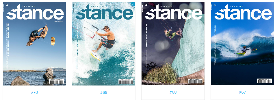
Stance Magazine’s sleek and striking masthead allows the cover image to sell this kiteboarding publication. A picture is worth a thousand words, after all, and so adding subtitles and headings would be superfluous in this case. They stick to white except when the background is too light, as we mentioned in Magazine Cover 101, opting instead for a contrasting color that is still in harmony with the cover image.
A Textbook Case of Cover Consistency
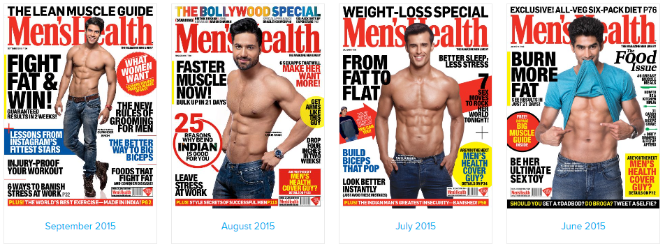
When you have a thirty-year-old brand (Men’s Health was launched in 1987), there’s no reason to throw out that kind of brand recognition. Men’s Health takes this to heart by featuring the same masthead in every issue: always red, always the same serif font. But their dedication to consistency goes further than that. They consistently stick to primary colors: red, yellow, and blue. Right under the masthead, the biggest text on the cover is always a bold sans serif featuring the issue’s biggest story. Above the masthead, there’s always the issue’s theme or exclusive content. And yes, the cover model is always a fit man looking right out at you.
Embracing Consistently Inconsistent Design
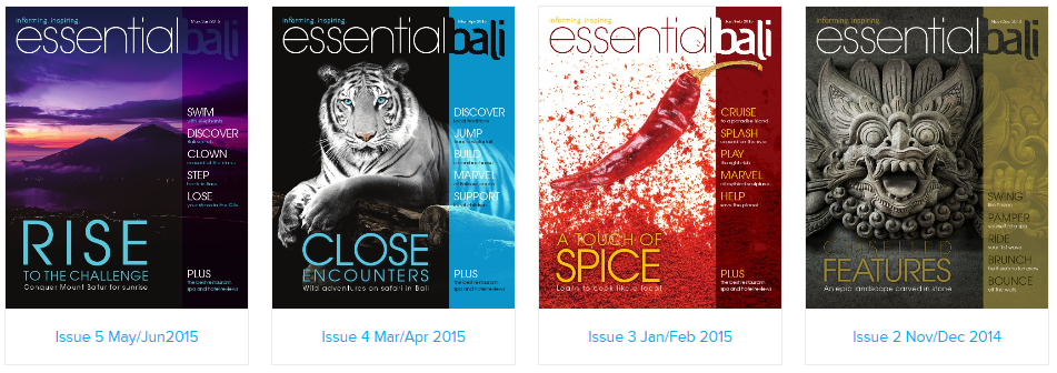
But if you don’t want to be married to the exact same colors and the exact same placement for each and every issue, don’t worry; there’s more than one way to be consistent. Essential Bali keeps the same skeleton throughout: sans serif masthead, colored stripe down the side with “bali” in negative space, the main article title on the left followed by other articles on the colored stripe with action words like “discover,” “jump” “cruise,” “swim,” etc. By keeping those elements consistent, they can use wildly different color schemes and cover images in each issue while still maintaining a brand that is cohesive and recognizable.
Leveraging Joomag’s Crater Editor for Consistent Covers
Joomag’s Crater Editor offers several options for you to channel this kind of consistency with your publication. Whether you upload your own cover and duplicate it each month before editing it or you choose to use one of our templates, we’re here to help you keep it consistent!

FAQ
1. Why is cover consistency important for magazine brands?
Answer: Consistency in magazine covers reinforces brand identity, making your publication easily recognizable to readers. It builds a visual connection that, over time, enhances brand recall and loyalty, as seen with brands like Men’s Health. Consistent elements like mastheads, color schemes, and layout patterns contribute to a magazine’s distinct look and feel.
2. Can consistency coexist with creativity in magazine cover design?
Answer: Yes, consistency and creativity can complement each other in cover design. Magazines like Essential Bali demonstrate that maintaining certain consistent elements (such as layout, fonts, and thematic cues) allows for creative flexibility in other areas like color schemes and imagery. This balance keeps each issue fresh while maintaining a cohesive brand identity.
3. How can Joomag's Crater Editor assist in maintaining cover consistency?
Answer: Joomag’s Crater Editor provides tools to ensure cover consistency easily. Users can upload their own cover design and duplicate it for future issues, making minor adjustments as needed, or select from a range of templates that align with their brand’s visual identity. This versatility supports the creation of consistent, professional-looking covers with efficiency and ease.


