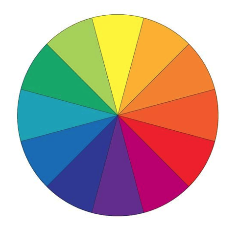
Creating color palettes isn’t as easy as throwing your favorite colors together and calling it a day. What are you trying to say? Are you creating something harmonious? While you can do it completely from scratch, it’s important to know the rules so that you know how to break them. Those rules are based on where colors are located on the color wheel.
Monochromatic
The easiest palette to make. Stick to one hue and select the tints, shades, and tones that you like. It’s a simple look, but you never have to worry about it looking sloppy. We used shades and tints of orange here. Yes, brown is considered a shade of orange!

Analogous
Another example of a hard combo to screw up, these color schemes are created by choosing three hues found next to one another on the color wheel. This scheme uses cool hues like blue-green, blue, and blue-violet.

Complementary
Complementary colors oppose one another on the color wheel. While you can work the power of opposites attracting to your advantage, placing opposing hues with high chroma next to one another can come off as garish and overstimulate the eye. We used muted tones and shades of red and green in this palette to keep it from looking too aggressively Christmassy.

Triadic
The color schemes are made up of three colors equally spaced around the color wheel. In this example, we used the three primary colors. While that color combination can come off basic and even juvenile, we chose low chroma, muted blue hues so that they wouldn’t compete with the red and the yellow. Instead, the blue hues take a backseat so that the red and yellow can really pop.

Split Complementary
While this has a complicated name, this is actually an easy color combo to put together. While complimentary colors are opposite one another on the color wheel, a split complementary scheme takes one color and pairs it with the two hues next to it’s opposite. For this color scheme, we took purple and it’s two split complements: yellow-green and yellow-orange. Instead of going for an aggressively high chroma look, we used different values but stuck with low saturation tints, tones, and shades to create a sense of soft cohesion.

Tetradic
Tetradic color schemes are some of the hardest to pull off well. They’re also called double complementary color schemes due to the fact that created from two sets of complimentary colors, equally spaced around the color wheel. Choose colors with similar chroma and values, or else your color scheme will look confused and busy. For this one, we chose deep tones of blue-green, red-orange, yellow, and purple. The high saturation and similar chromas unify what would otherwise be a scattered color scheme.

Creating Your Own
While it’s good to know the rules, it’s okay to break them if you know how. For example, this palette doesn’t follow any of the traditional color schemes. Instead, these colors are unified by similar chroma and saturation levels.

In this example, we played around with the rules of an analogous color scheme. We chose tints and tones of red, red-orange, yellow, and yellow-green. Unlike an analogous palette, we used four hues instead of three and skipped yellow. Still, these colors are close enough on the color wheel and have similar values.

Don’t be afraid to lean heavily on neutrals, either. This color scheme relies heavily on the heavily saturated blue hue. It’s tied to the blue-green color due to their similar saturation levels. Now, take a closer look at those grays: they’re actually low-saturation tones of that same blue!

Palette Creation Tools
Sound like a lot of work? While it can be, it’s well worth it. But if you’re looking for some short cuts, here are some our favorite free online tools:
Paletton does the work of creating traditional color palettes for you. Choose from options that range from monochromatic to tetradic and then adjust the wheel and other settings until you have the palette you’re looking for. You can even preview what your color palette will look like as a pattern or as a website.
Coolors lets you create a five-color palette with one tap on your spacebar. While you can tap away and generate a random new color palette until you find the one you like, it also allows you to manually manipulate the colors. Get the perfect shade, and deepen the saturation!
Adobe Color does a lot of what other tools do, but it’s great if you have an image you want to create a color scheme from. It can select five harmonious colors in your image, but you can pick and choose what you like as well. This is a great tool if you have a cover image for a magazine in mind and want to pick matching colors for your headlines.
FAQ
1. What are key types of color palettes?
Color palettes vary from simple monochromatic, featuring variations of a single hue, to complex tetradic schemes, which combine two sets of complementary colors. The choice depends on the desired aesthetic and design goals.
2. How can I customize my color palette?
For a unique palette, mix colors based on chroma and saturation, not just traditional schemes. This approach allows for creative flexibility while maintaining visual harmony.
3. What tools assist in palette creation?
Paletton, Coolors, and Adobe Color are useful tools for creating color palettes. They range from generating random schemes to extracting palettes from images, simplifying the design process.