Awhile back, we shared our streamlined process for choosing typefaces. But if you’re just using one font for body text, another for your headlines, and then calling it a day, you’re not using typography to it’s greatest potential.
A solid hierarchy of typography will guide your readers through your publication. Your choices of fonts, weights, and sizes determines what catches the reader’s eye first, how your writing flows, and the order in which they’ll absorb the information you’re trying to get across.
First, the basics
-
-
Don’t work against your reader’s instincts. For example, English readers generally read top to bottom and left to right.
-
Size matters. Sometimes using the same typeface throughout and just increasing the size for your headlines and subheadings can be enough.
-
Never, ever, ever sacrifice readability. Save those fancy fonts for headlines and subheadings.
-
Let’s look back at the examples we used for our first post about typefaces to see if these publications hold up.
Keeping it simple
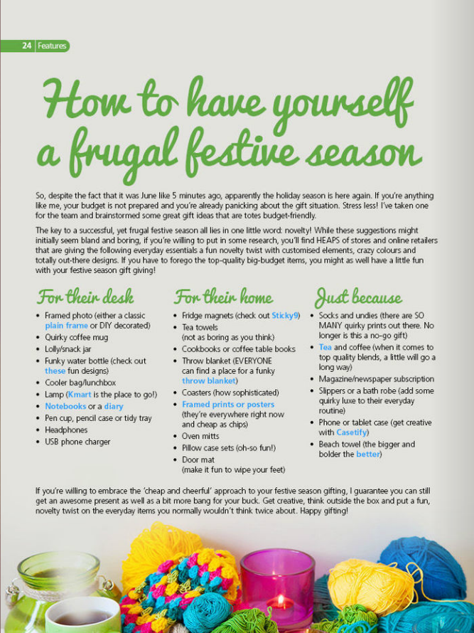
This page from HeyU keeps it simple. The cursive font used for the headline and subheadings is still legible because of it’s size. The larger font of the headline reinforces your eye’s instinct to start at the top of the page while the smaller subheadings tell your eyes, even more you read the bullets below them, that these are smaller subtopics related to the bigger topic of the title.
They don’t stop there with color, either. See those blue words in the bulleted sections? They’re not just there to draw your eye, though if this were a print-only publication, that’s all that blue would do. They’re actually embedded links! Using our Crater™ Editor, you can add links to other sites and additional content. If you’re looking to use your publication to bring traffic to your other sites.
Relationship status: it's complicated
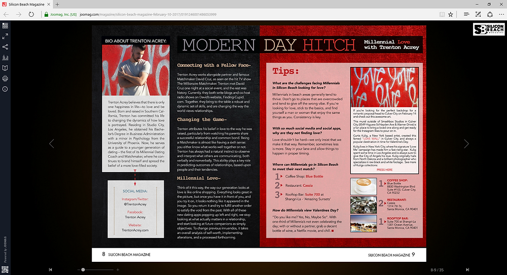
This layout from Silicon Beach Magazine may use only two typefaces, but they still manage to mix things up by using other elements to create a complex hierarchy. Let’s dive into the different elements they used.
In spite of the busy layout, it’s clear that MODERN DAY HITCH is the headline. It’s the largest piece of print, it’s in all caps, and it’s at the top of the page where we expect a headline to be. But after that, the hierarchy gets complicated. There’s a lot of information packed into these two pages and each section doesn't necessarily flow into the next.
However, that’s not to say that this is layout doesn’t have any hierarchy at all. Quite the opposite. Here, we see the use of color to separate content into smaller pieces. The instinct of an English-language reader is to start on the top left, and that’s where the about the author section was placed. Considering that he’s the one giving the advice in this layout, establishing his credentials in the first place your reader is likely to look is a good choice.
After that, it’s totally up to your reader what they want to look at next. Considering the content is dating advice, that works! After all, people usually prefer to pick and choose what advice to follow whether they hear it from a friend or it comes to them in print. While there’s no strong hierarchy determining which section is most important, within each section, it’s easy to see what the questions or subtitles are: they’re in a larger font and are bold-faced. The use of different colors keeps each section distinct while still being a part of a greater whole.
Whether you want a straightforward hierarchy or something more complex, Joomag’s Crater™ Editor gives you the tools you need to keep it simple and all the options you’d want if you want to mix things up.
FAQ
Q1: Why is a solid hierarchy of typography important in digital publications?
A1: A well-structured typography hierarchy guides readers through your content effectively. By strategically choosing fonts, weights, and sizes, you direct attention to key sections, improve the readability of your text, and control the order in which information is consumed. This ensures your message is communicated clearly and engagingly.
Q2: Can the same typeface be used effectively for both headlines and body text?
A2: Yes, using the same typeface for different parts of your content can still create an effective visual hierarchy, provided you vary the size and weight. For headlines and subheadings, increasing the size can differentiate them from the body text, guiding the reader’s eye through the publication without sacrificing design simplicity or readability.
Q3: How can typography enhance the functionality of digital publications beyond visual appeal?
A3: Beyond aesthetics, typography can enhance the functionality of digital publications by incorporating elements like color and links. For example, using colored text not only draws attention but, when used in digital formats, can signify interactive links. This dual-purpose approach enriches the reader's experience by making the content more navigable and interactive, encouraging deeper engagement with the publication.


